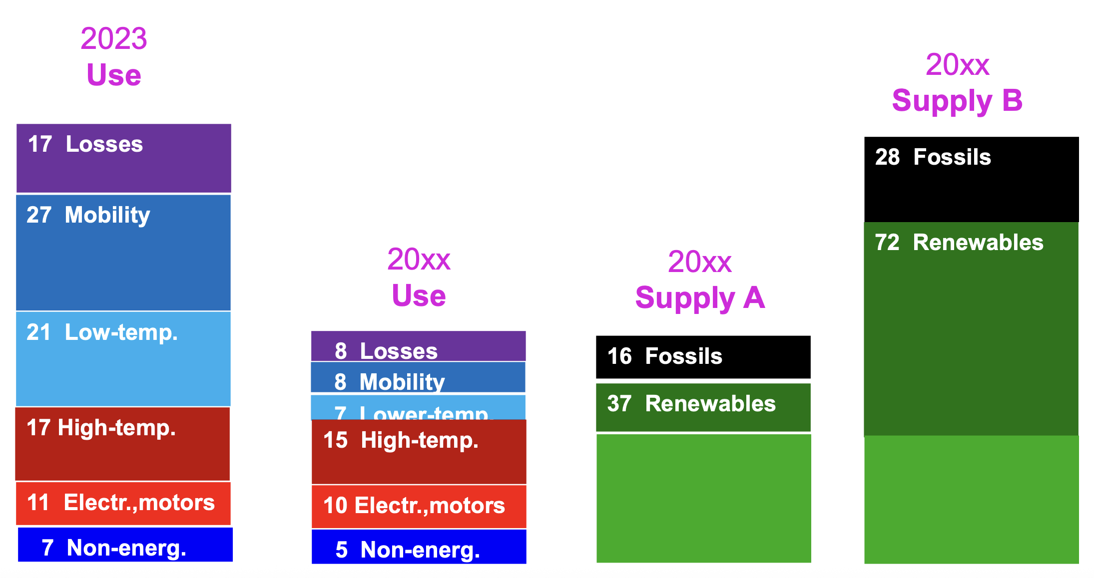
Energy balances should present the full picture of an energy system, tracing energy flows from end-use services back to primary sources. Yet most statistical reports still begin with final energy consumption and only then work upstream to primary energy.
The accompanying chart for Austria goes further: it shows useful energy – a metric very close to actual energy services. All figures are indexed to 100 for total energy supply. The indicated losses of 16 reveal, for example, that 16 percent of the supplied energy is lost during conversion and distribution.
Although seldom highlighted, this chart offers valuable insight into how energy is actually used. It also includes modelled scenarios illustrating how higher efficiency could significantly reduce energy consumption.
Source: energyfutures.net
Thermal, mechanical, and specific electrical services
Energy chain from energy services to primary energy